Looking good
2018-08-27One of the questions I had when pondering the rare mob collection project was how to improve the quality of the screenshots - pictures or it didn’t happen, after all.
After a bit of hunting around, I found that there a few console only settings in Warcraft related to the screenshot quality. If you type these commands in the chat window and press enter, they are changed permanently everywhere. (You don’t get any feedback that anything happened, but it does work.)
The first is choosing between JPG (the default) and TGA. TGA is a lossless format, so the image quality is higher and non compressed, but it is a fairly arcane format - you’d want to convert it to something more useful like PNG to use it on Wordpress et al. In any case, the command to change it to TGA is:
/console screenshotFormat tga
And to switch back to JPG:
/console screenshotFormat jpg
Sticking with JPG is more convenient, but the default quality is pretty average. The good news is there’s another console setting that bumps up the JPG quality until it’s barely different from the TGA files (confirmed by much internet commentary). Wowheads screenshot submission guidelines state the default JPG level is 3, but we can bump it all the way up to eleven 10:
/console screenshotQuality 10
I tried this and while the difference is noticeable if you look closely, it’s not as huge as you might expect. One byproduct is the filesize grows from about 500KB to 2MB, but with some judicious resizing the filesize gets more reasonable. So it seems changing the quality setting is not quite enough. Which means learning more about doing some post processing on them.
There are some great photography-inspired tips in this excellent article on Blizzard Watch which seems a good place to start. Aside from the framing tips, the main advice seems to be about adjusting colours and contrast, to get the details to really pop and sparkle. The main problem I see is that the screenshots are too dark, so I played around with an image of our second RFC run to see what could be done. Here’s the default shot:
The heavy contrast is quite nice, but it does tend to hide much of the detail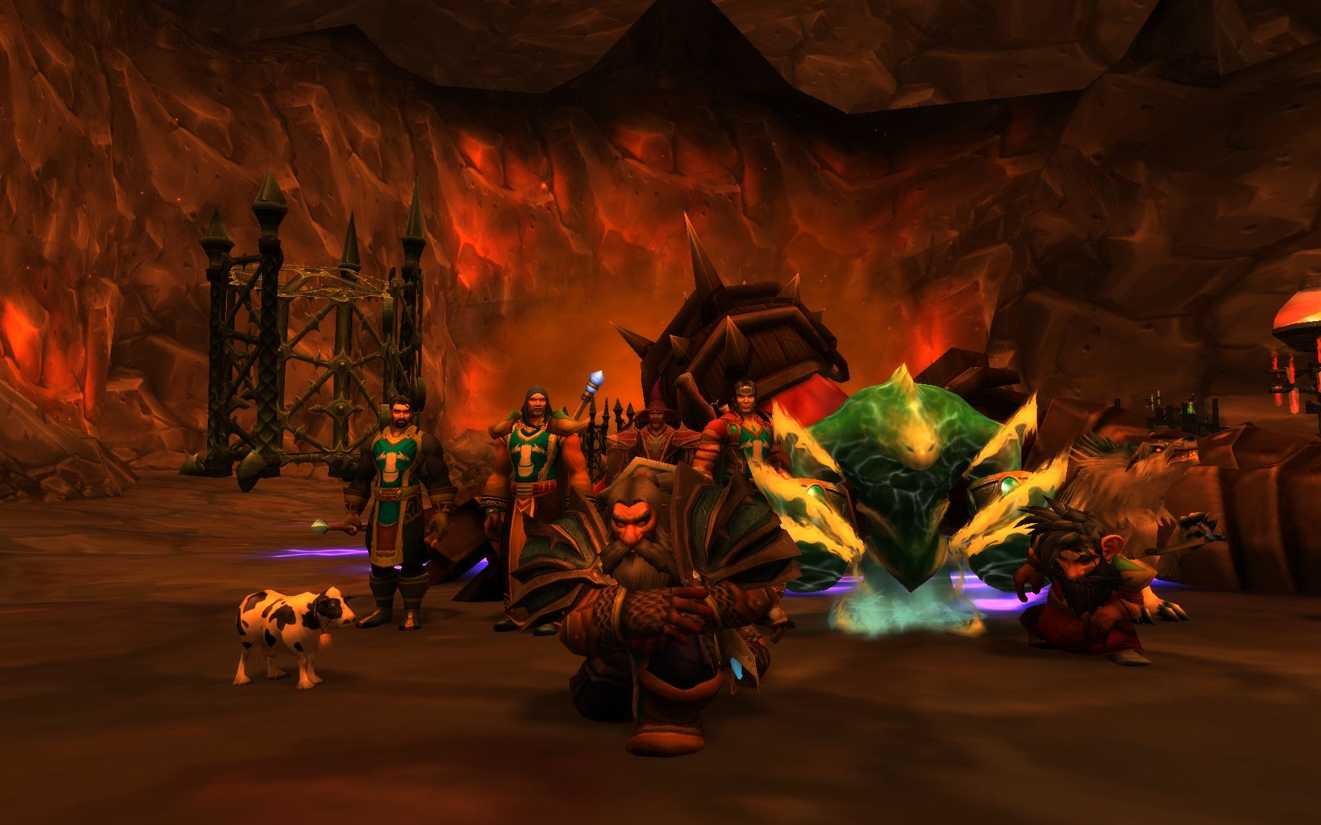
Using Irfanview (which admittedly is more of a viewer than an editor), I mucked around with adjusting contrast and saturation, but in the end found that the ‘auto adjust colours’ setting did a pretty good job:
Deatils are much clearer, at the cost of some depth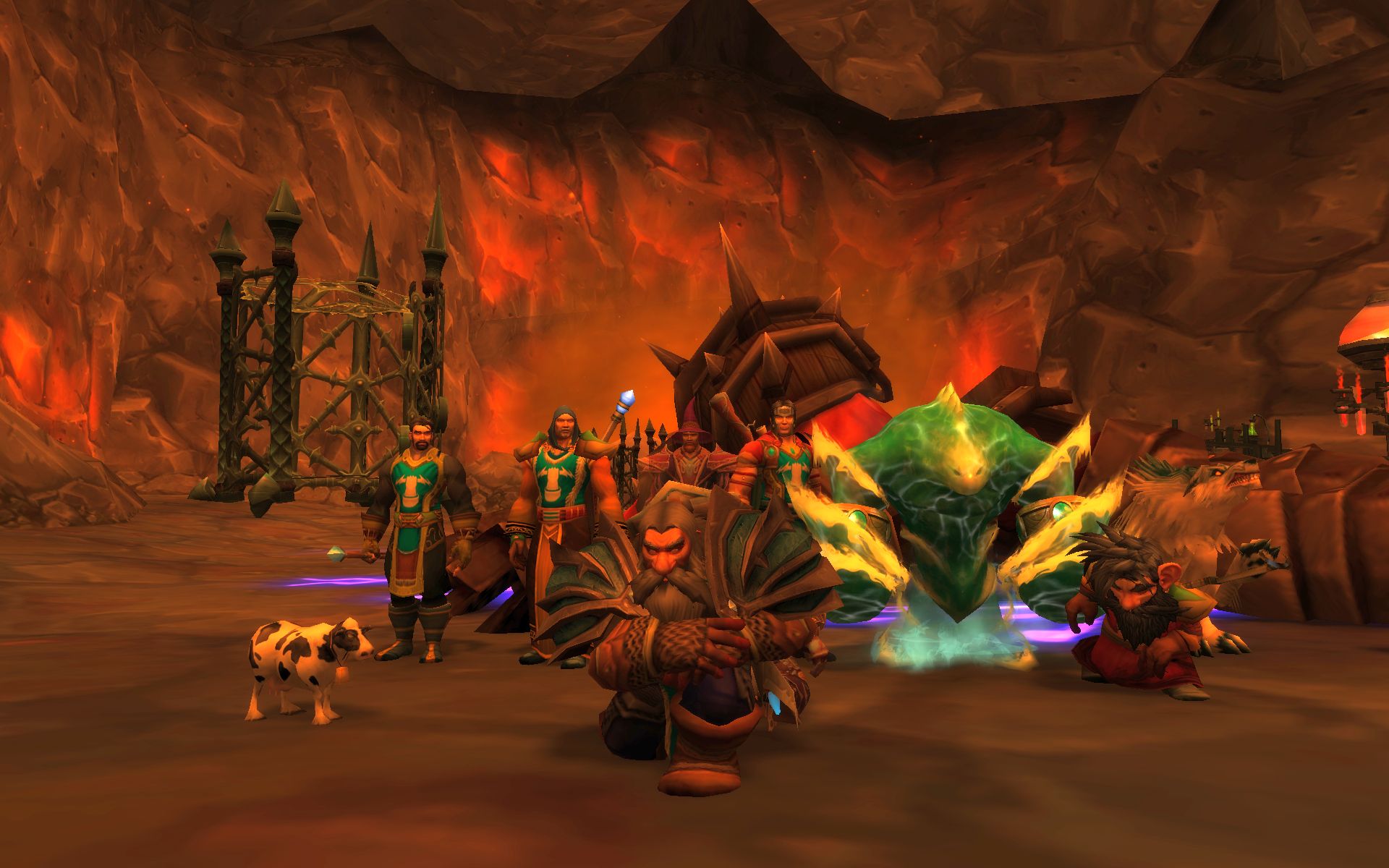
Finally I used the ‘sharpness’ setting to see what that would do:
Things like belts, tabard edges, and moustaches(!) are picked out, though there is some jagged edging
Hm. I like that you can see more once it’s adjusted, but it does wash it out a fair bit. I guess using the default settings isn’t a great plan - more to learn and more experimenting to come. Either that or I should just start taking screenshots in daylight…