Warcraft Classic: UI and add-ons
2019-09-02After testing a few things I think I’ve settled on a UI for Classic. Or at least settled on the fundamentals. I decided against a full UI replacement with ElvUI. Despite the convenience of one-add-on-to-rule-them-all, it’s less fun than creating your own, certainly during the early days when there aren’t as many add-on choices. Plus , when levelling, things like Boss Mods and rotation optimisation aren’t nearly so important, meaning you can concentrate on just adding bits and pieces that make it more enjoyable to play.
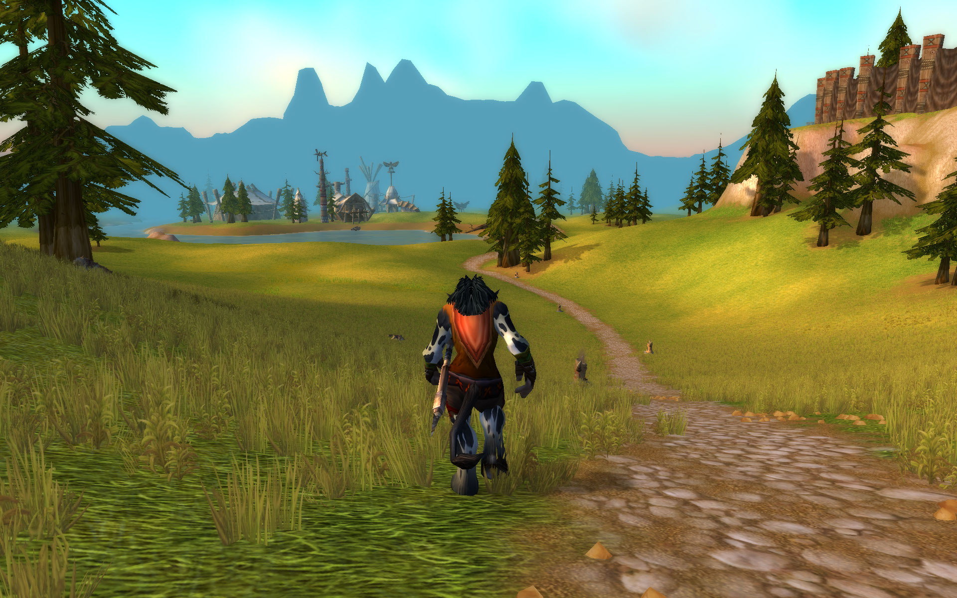
I played for a few days and started noting down the things I was missing. The most immediate one was having unit and action frames closer to the centre of the screen where my character is. Having to constantly shuffle your eyes down to the action bars at the bottom of the screen, and way up to the unit frames at the top left, means often missing out what’s happening to your character in the middle. That can be bad when adds start coming, but also it means not seeing nice attack animation and even just admiring mob design mid battle.
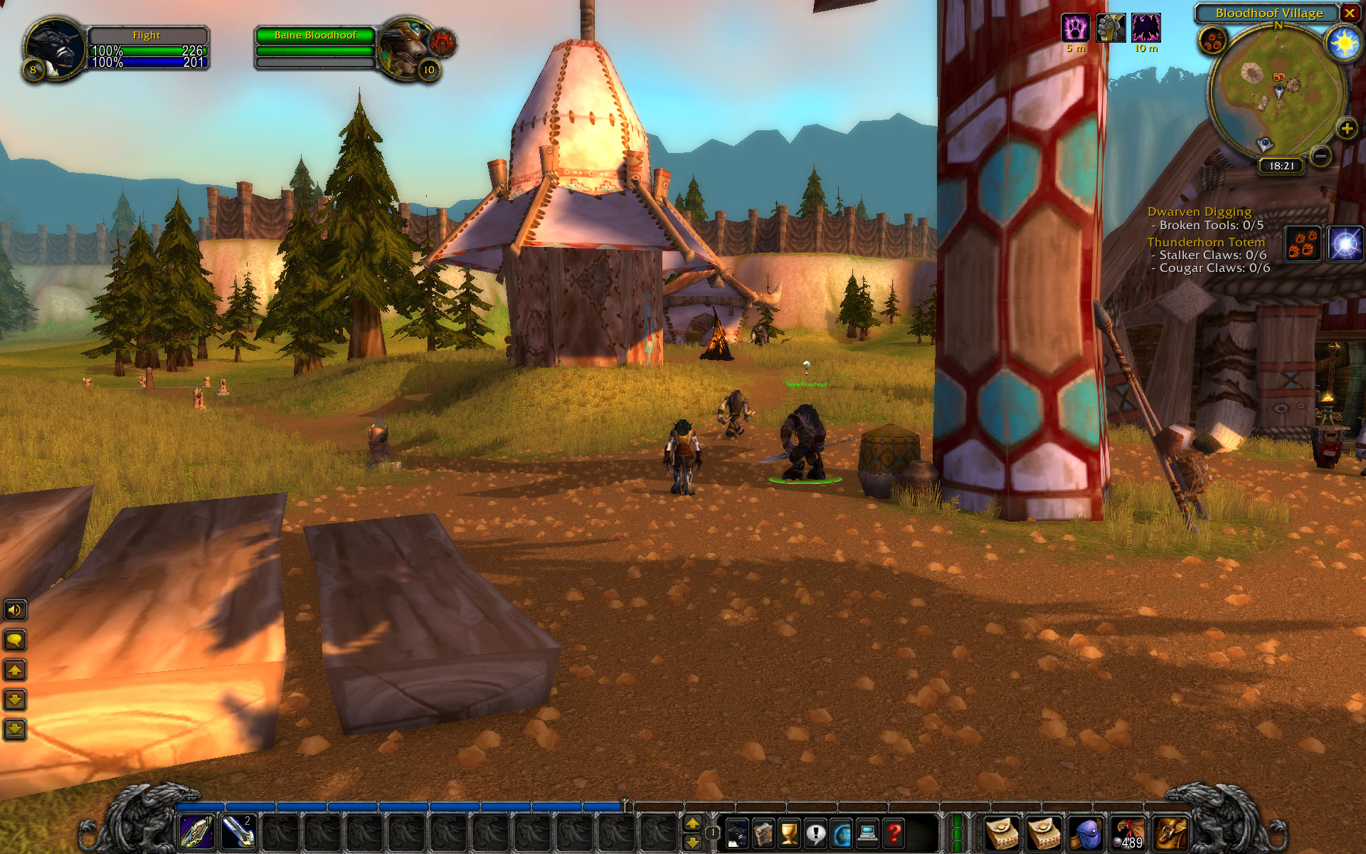
The default UI - functional but not eyeball efficient
After testing a few things to solve that issue, I chose Bartender4 (BT4) for the action bars, and Shadowed Unit Frames (SUF) for the, uh, unit frames. Both were tools i used in BC so it was a nice throwback as well as being useful.
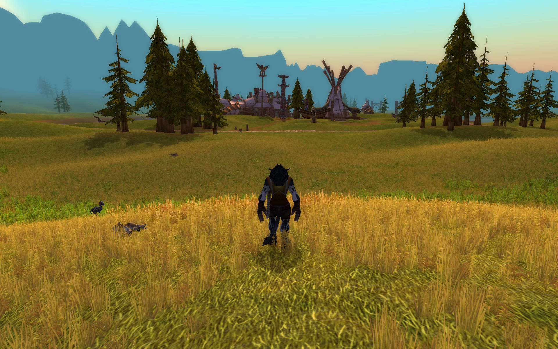
UI hidden - the best view of all
Bartender is easy to configure and immediately simplifies the screen by removing a lot of the Blizzard chrome. It also allows easy hiding of bars that you don’t want, and you can move those you do whereever you like. So now I have my main actions just below my character on two bars. Similarly SUF simplifies the look of your character frame, and the target and target of target, etc. There’s a lot of options, but the defaults work well and match BT4 well too. One favourite feature is hiding unit frames when out of combat, which cleans up the world view considerably.
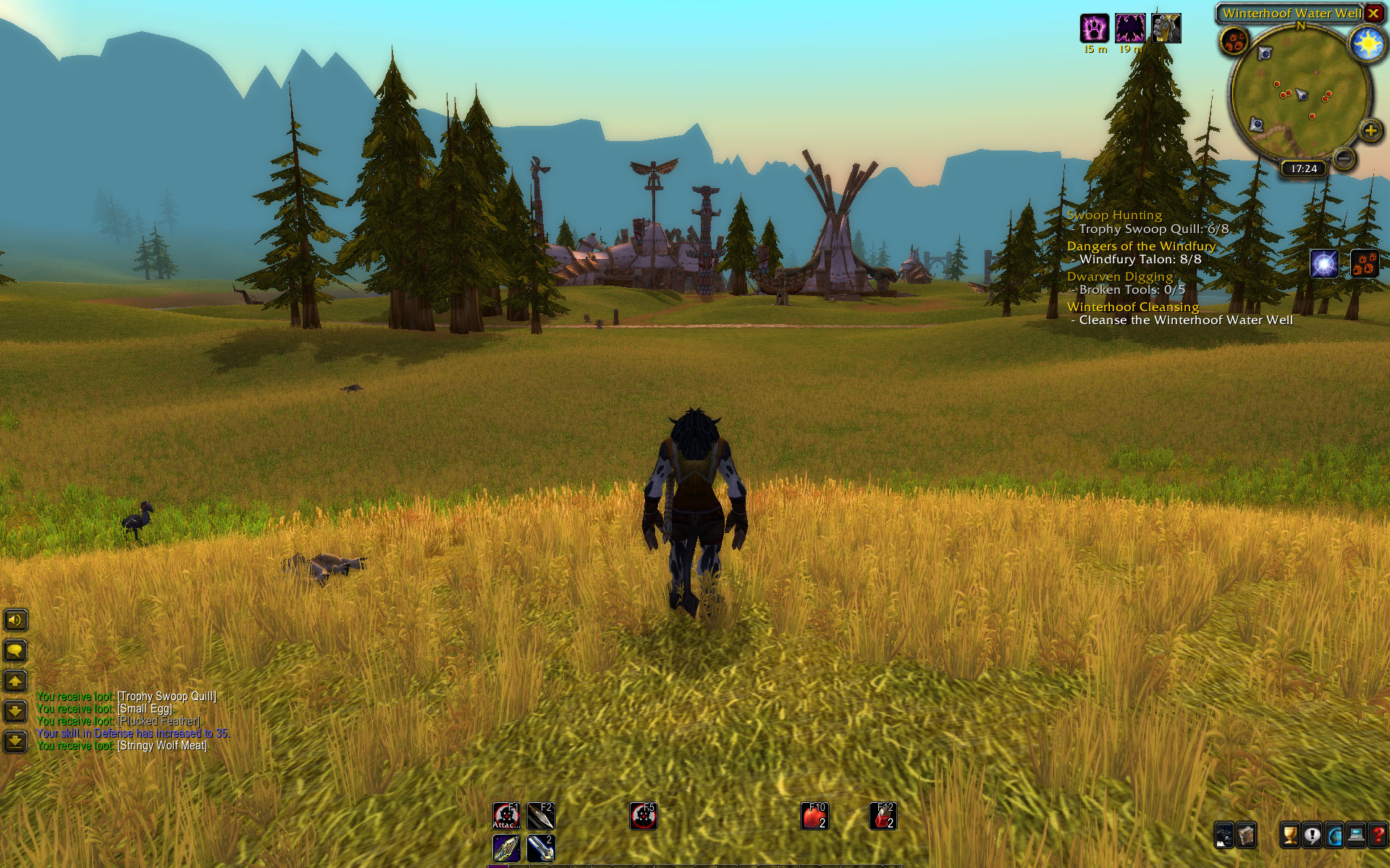
Modified UI when idle. Hides a lot of the cruft to make the world a lot more visible and pleasant. It’s not too much busier than a totally hidden UI
The next obvious thing was a bag replacement. It didn’t matter too much at first given only one bag, but the sudden proliferation of tailors making linen bags to level their skill meant a bag add-on was a big help. I tried Bagnon and Inventorian, but didn’t love them. Then I found that TBag had been recreated for Classic and rejoiced. TBag is my favourite bag add-on - super simple, fast, colour coding, and category sorting all add up to a winning combination. It’s unfortunately been abandonded for Live - another reason Classic is Better!
For nameplates I added Threat Plates, which has the advantage of helping with threat management as a tank. It colour codes the threat levels (green when you have threat, red when you’ve lost it, and yellow when you’re losing it) and can work for either tank or DPS classes. I may change this for DPS use depending on what I end up levelling the most, but at the moment it’s working fine.
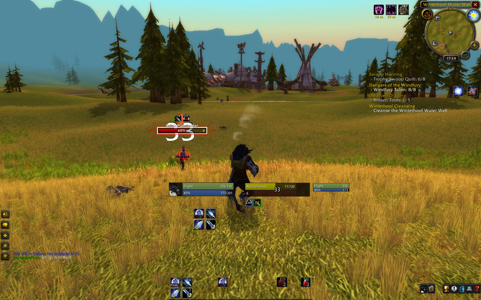
Modified UI in combat mode. All the important stuff is happening where your eyes should be
Those were the main things I replaced that made the game nicer to play without changing the experience too much. I’m also using OmniCC and Classic Aura Durations, just to have nice countdowns and sweeps on abilities.
The other thing I tried briefly was ClassicCodex, mainly because I saw some screenshots that showed interesting things like the percentage drop chance of an item and this was the add-on that did that. But I soon disabled it because it added much more than drop stats. It introduces a lot of the quest conveniences we’re used to on Live and more - map icons for quest givers and hand ins, dots on the map to show quest locations, spawn locations for quest mobs, etc. It was also default configured to auto accept and auto hand in quests, which totally confused me for a minute. So it basically felt a lot like a fast levelling tool, which is fine but not something I was looking for or interested in.
Once I get into Dungeons I might try AtlasLootClassic, as it was another original add-on and it’s fun seeing what the bosses might drop and planning accordingly - but I wonder if it too might be a bit too revealing, like the Codex add-on.
I’m enjoying the slower pace so something that interrupts that to make you more productive actually seems counterproductive in a weird way. SynCaine nails this contradiction when analysing a MassivelyOP post revelling in the slowed down nature of Classic which at the same time talks about how to speed it up: I love the difficulty so much I installed a mod to remove it!.
Using the default UI is completely workable, and is theoretically more ‘Classic’, but in the end I agree with Belghast’s tweet where he said that using add-ons has been as much a core part of Warcraft as the game itself. It’s fun to use them, and it’s incredible seeing what people have created to enhance the game.
Comments:
Grimmtooth - Sep 2, 2019
I’m happy to find that Dominos made the transition to classic as well, but I elected to not go with unit frames yet because, it turns out, you can move the native name plates now (unlock frame -> drag them wherever you want, then lock them back. It’s in the right-click menu for the unit frames.) I’ve been thinking of doing that for Live as well - one less thing to break in the UI. I use Grid for my raiding so …
Most of what I’ve added are quality of life addons - IceHUD, a bag addon (still making up my mind on that), WIM, Prat, that sort of stuff. As a result, my UI is pretty lightweight in Classic. Maybe I can take a lesson from that and wean myself off of some of the 90+ addons I tote around in Live. :)
stroeb - Sep 3, 2019
Ah that’s a good tip on the Unit Frames - I thought there was a way to do that but was too lazy to work it out. I like how SUF can show buffs and debuffs etc, but maybe the default can too - I haven’t looked at it for a long time having always had a UF add-on loaded. 90+ sounds challenging - sounds like a recipe for LUA errors everywhere! I have a friend with a similar setup, it must surely slow things down, though maybe/hopefully only on load.
Bhagpuss - Sep 2, 2019
I’m sticking withthe default but not because it’s “Classic”. I hate looking at the center of the screen in combat. I learned MMORPG combat from EQ in the days when, as a caster or healer, you’d spend most of the fight (when grouped) sitting and medding with your entire screen filled with your spellbook. I learned to follow the fight primarily by sound and by reading the chat box. I still prefer to do that in any game that facilitates it and WoW certainly does.
Also, over two decades my brain has been trained to look at the upper left corner for stats on my character and group and either the lower left corner or lower center for skills and spells. If I put them anywhere else chaos ensues. I have recently, successfully, moved my health bar to just above the action bar in some games but that’s really about as radical as i want to get.
I totally agree that all MMORPGS look better with no UI at all and I often travel like that as well as standing and admiring the view. I have on occasion, in certain games, even fought mobs with no UI at all. Some games only really need two or three key presses in combat. Mostly, though, in fights I don’t want to look at the pictures. I want to look at the controls.
stroeb - Sep 3, 2019
Sound and chat box reactions - that’s very impressive! Id love to be slightly less reliant on the UI, but I find I rely a lot on the cooldown timers on abilities so need some kind of visual aid for that. I guess as screens have got bigger the eye movement requirements have increased too, so centralised or consolidated UIs have become more necessary - for me anyway. I don’t know how people can play on the ultrawide screens when the right side is miles away from the left. In the early FFXIV levels I found I could pretty much fight with no UI which was fun for screenshots, but that was mainly due to only having two abilities and that long GCD. PS: Off-topic but do you have any tips about how to comment on your blog - I have tried nearly everything under the sun but can’t get mine to save.
Grimmtooth - Sep 3, 2019
A lot of the addons I use on Retail are for things I won’t be doing on Classic, such as a random mount summoner (GUPPet), but yeah, it’s taken a lot of time to sort out errors (I’ve gotten pretty good at it). SUF does make managing buffs and debuffs a little easier, though for the ones I can / might manage, I have Grid and for the ones I can’t, well, varying strategies, but the upshot is I rarely look at my unit frames for important cues anyway.
stroeb - Sep 4, 2019
I seem to recall you were doing some add-on development of your own, so that must help with taming the problems. I was going to try and made a simple add-on for flagging known rares in Kalimdor/EK, but struggled finding any good source of information and discussion.
Grimmtooth - Sep 4, 2019
I … hack on bits of UI code, not really being quite comfortable in the Lua world, but yes, it helps (I’ve got local copies of five or six abandoned ones). WoWWiki has documentation on both the retail and classic UIs, if that helps.
stroeb - Sep 5, 2019
Thanks, I’ll take a look at WoWWiki.